Branding, Strategy, Experiential
Branding, Strategy, Experiential
A lust for language —
Rebranding Berlin Bilingual School
More than 10 years ago, a small group of young enterprising parents embarked on the adventure to found a school for their children, because they wanted them to learn in both German and English, the languages they were speaking at home. At that time, there was no bilingual school in the East part of Berlin, and so these parents formed an association and in 2007 joined with Pfefferwerk Stadtkultur gGmbH to establish a bilingual primary school.
Opportunity
Client pitch win. BBS required an updated look and feel that should communicate its values. It should resonate with a diverse audience, namely investors, parents and most importantly school children and also reflect the three key facets, — Bilingualism, community and internationalsm.
Outcome
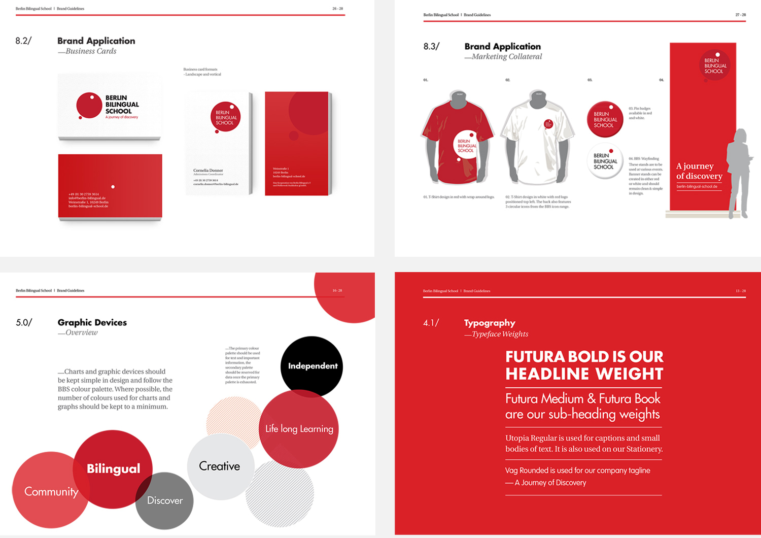
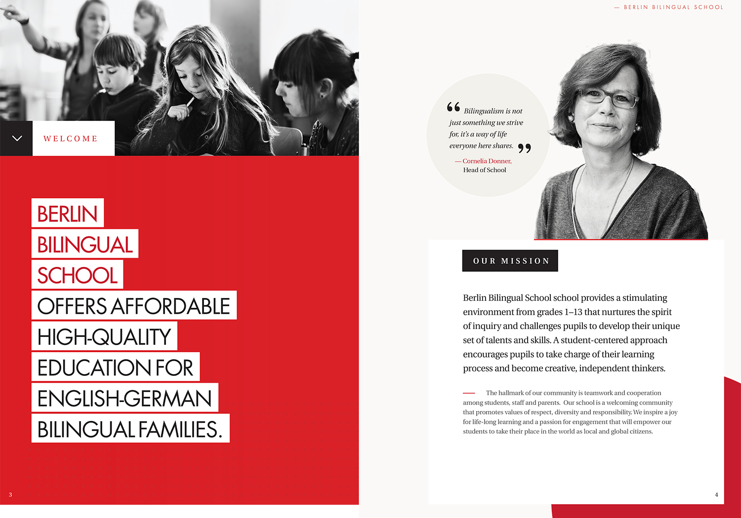
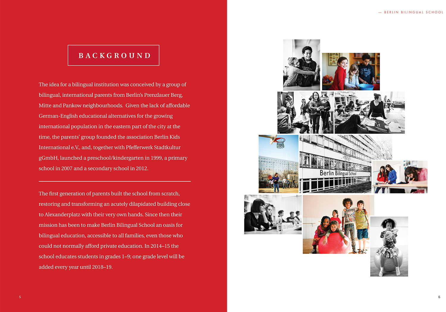
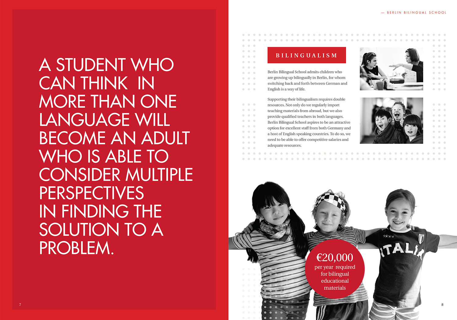
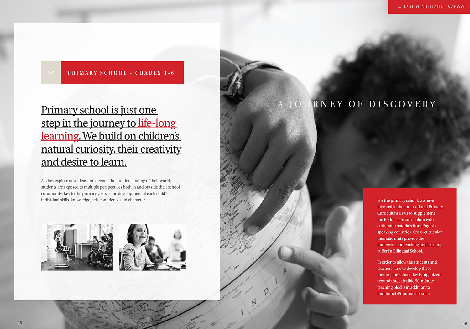
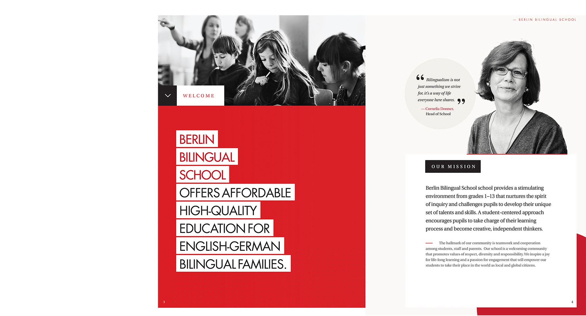
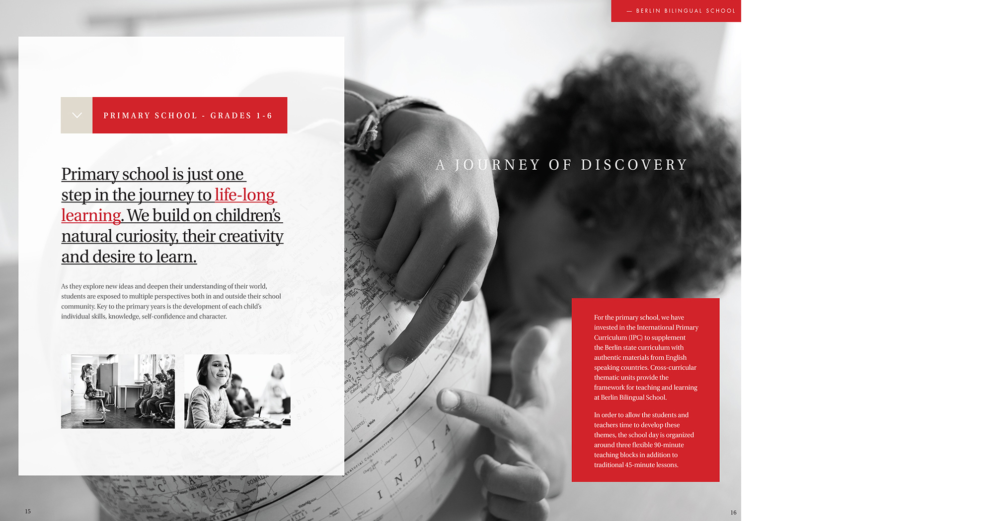
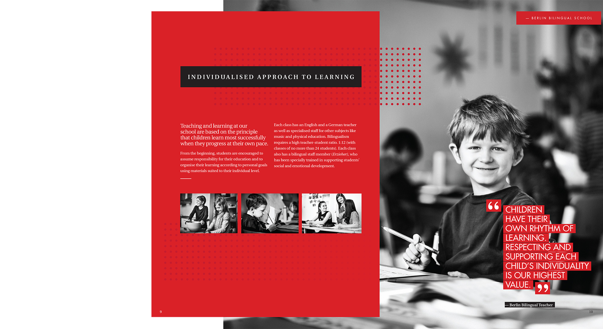
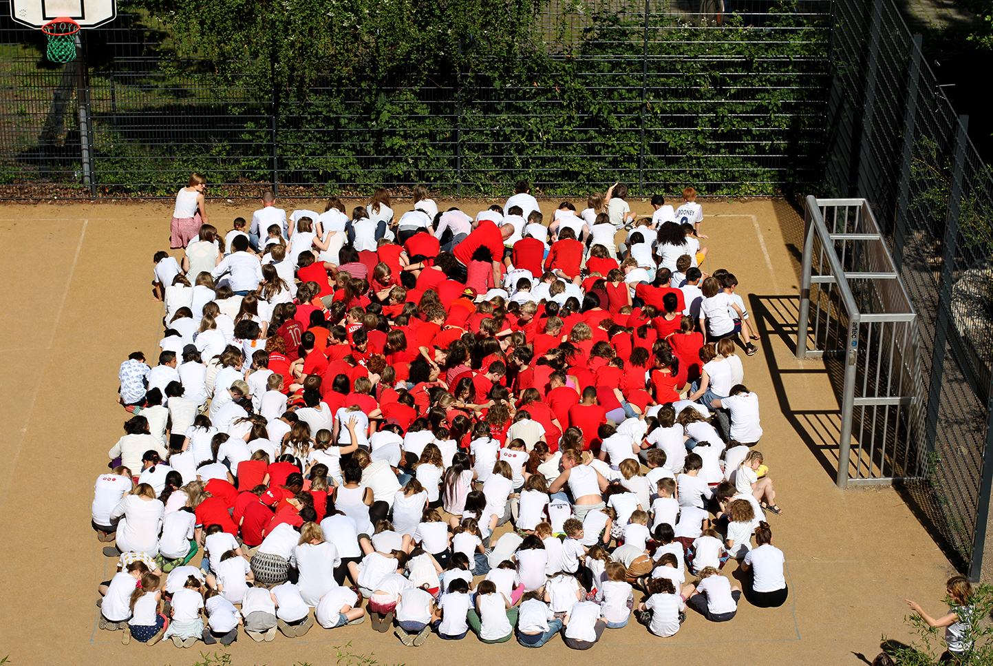
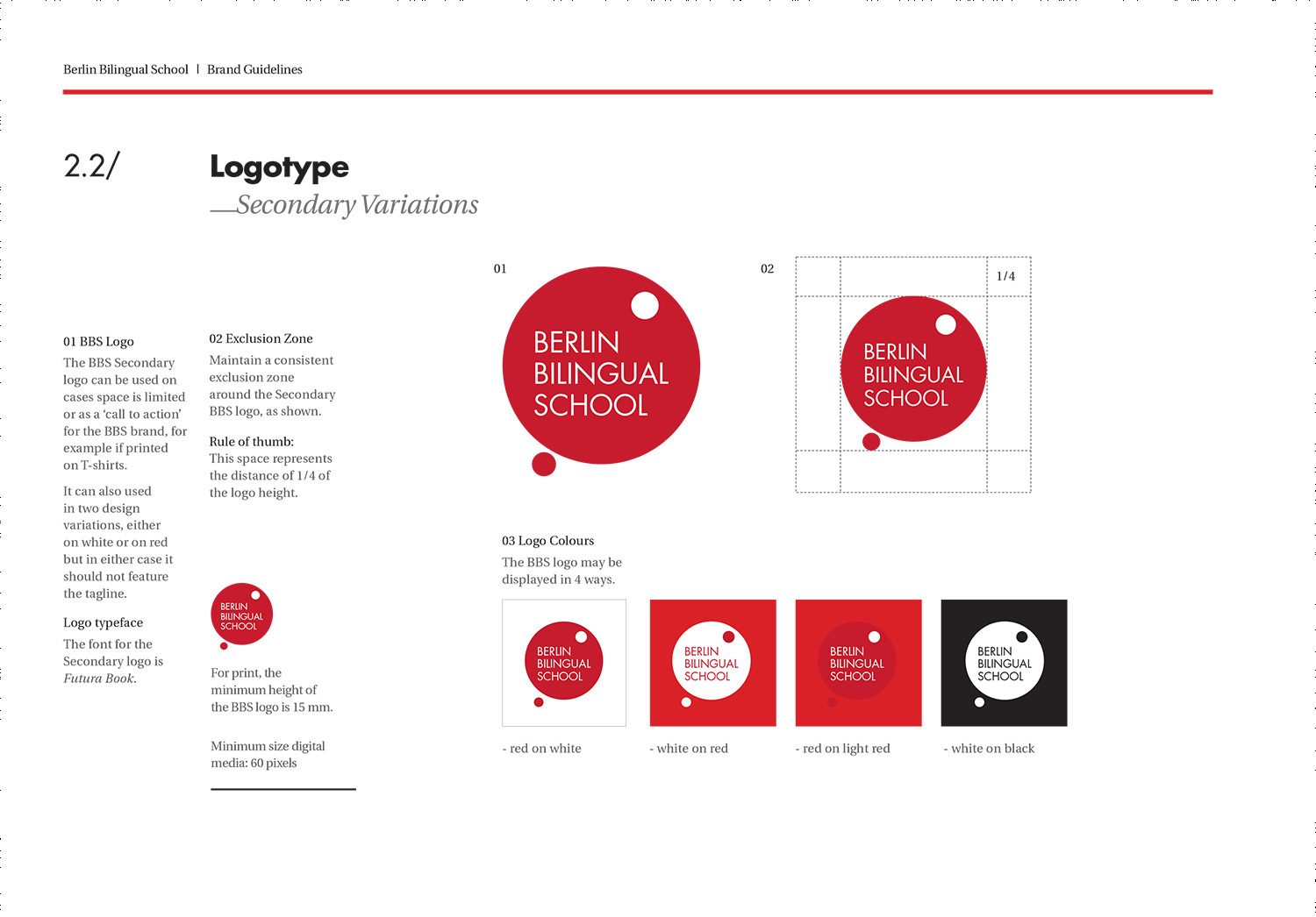
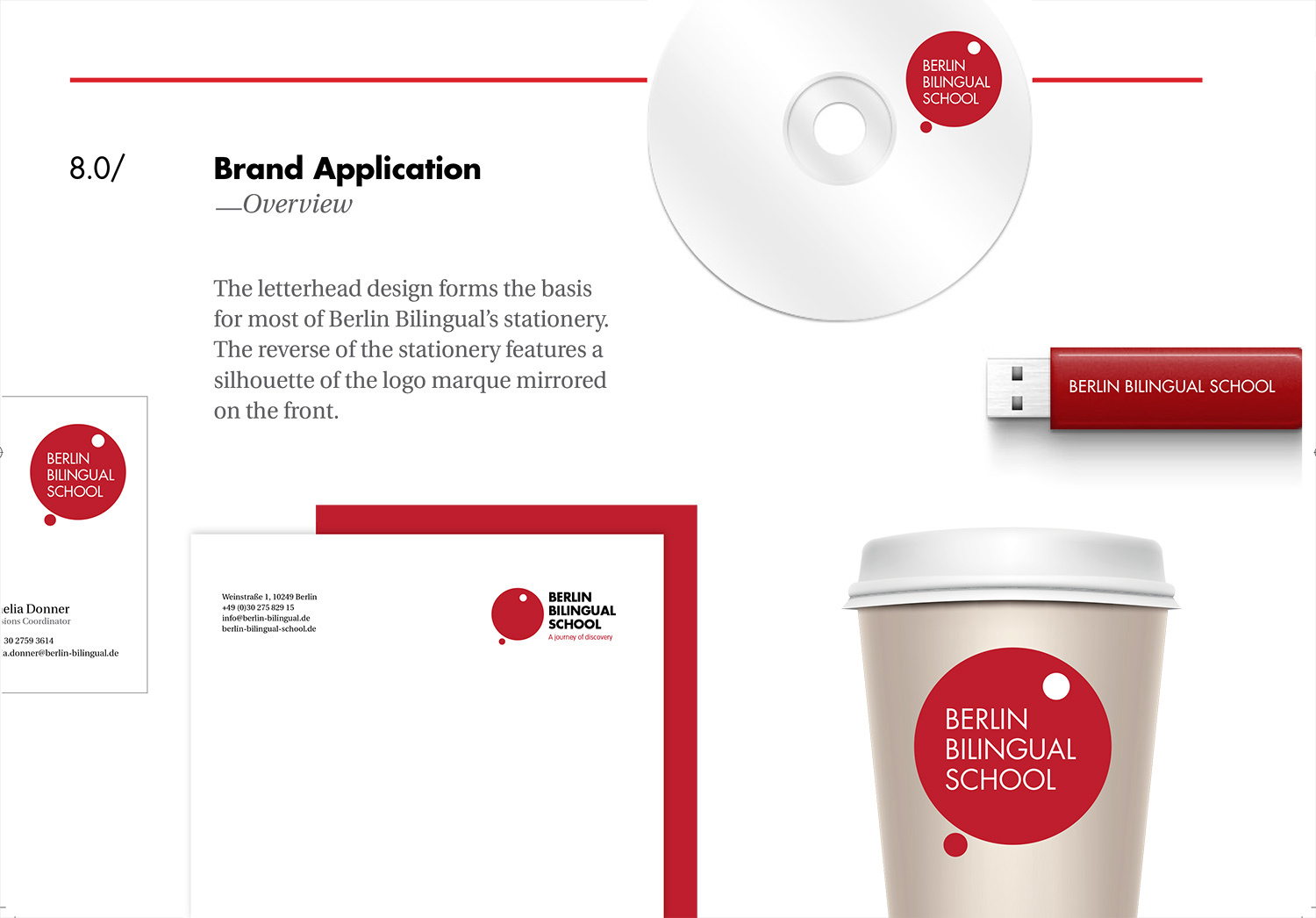
A selection of uniformed assets were created to help breath new life into the school. These included logo mark, brand guidelines, stationery, fundraising brochure, wayfinding and merchandise. The BBS brand was also well received by its users (the kids) and led to them creating their own branded assets — bag tags, coat hooks and one giant human logo.
Building a Design System
Building a Design System
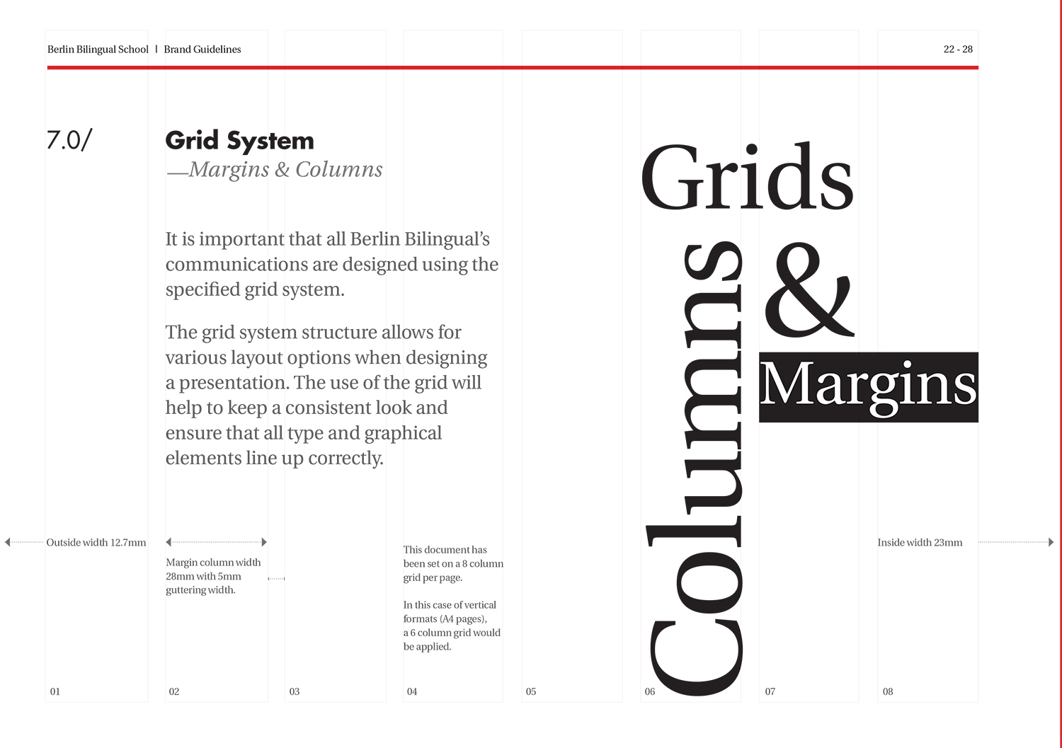
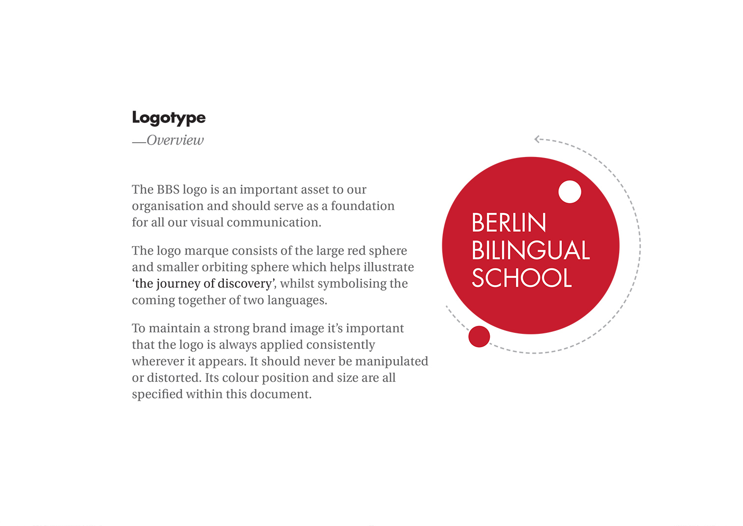
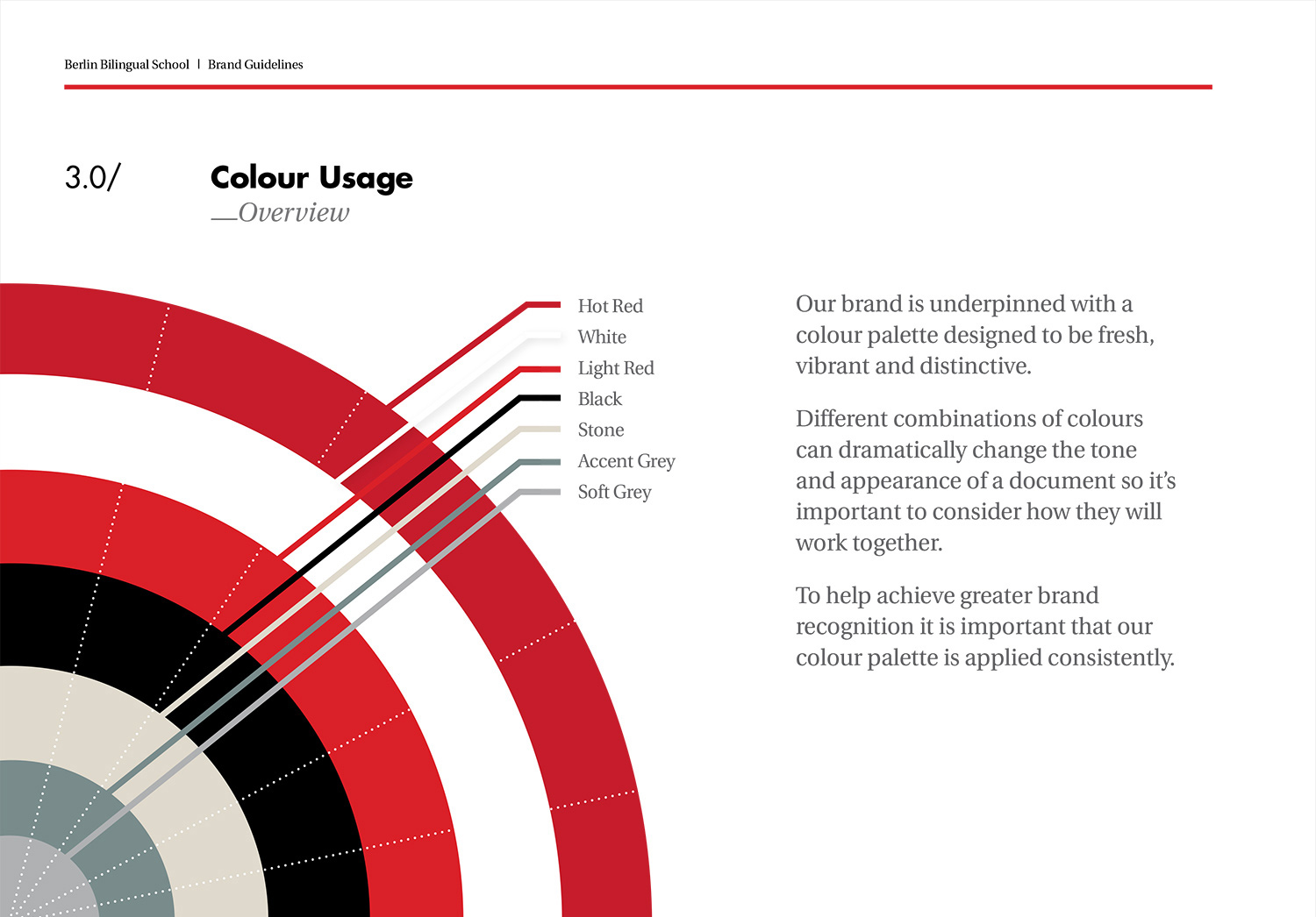
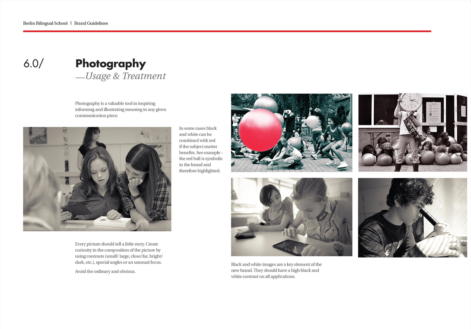
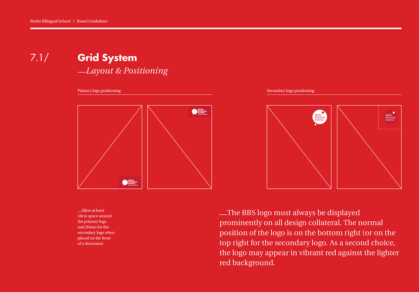
A cohesive design system was put in place to define standards and rules throughout BBS. A guide that illustrates the core design principles: community, discovery, and bilingualism through its many branded channels — print, digital, experiential and merchandise.
