Creative Direction, UX, Brand
Popular Shopping list App
'out of milk' gets a refresh.
Popular Shopping list App 'out of milk' gets a refresh.
Available on Android and iOS, Out of Milk is the biggest shopping list app on Android in North America, with close to ten million downloads. It simplifies the in-store shopping experience, conveniently letting users create, manage and share shopping lists with family and friends on mobile, desktop and email. With easy-to-use features and an intuitive interface, Out of Milk is also top-ranked in its category, with an impressive 4.6 overall rating in the Google Play Store across 200,000 reviews.
Opportunity
To update and simplify 'out of milk's' user interface whilst retaining and respecting the key features central to the user. In addition, a strong focus was dedicated to monetisation. Adding brands, products and retailers to the experience proved a great opportunity to increase revenues.
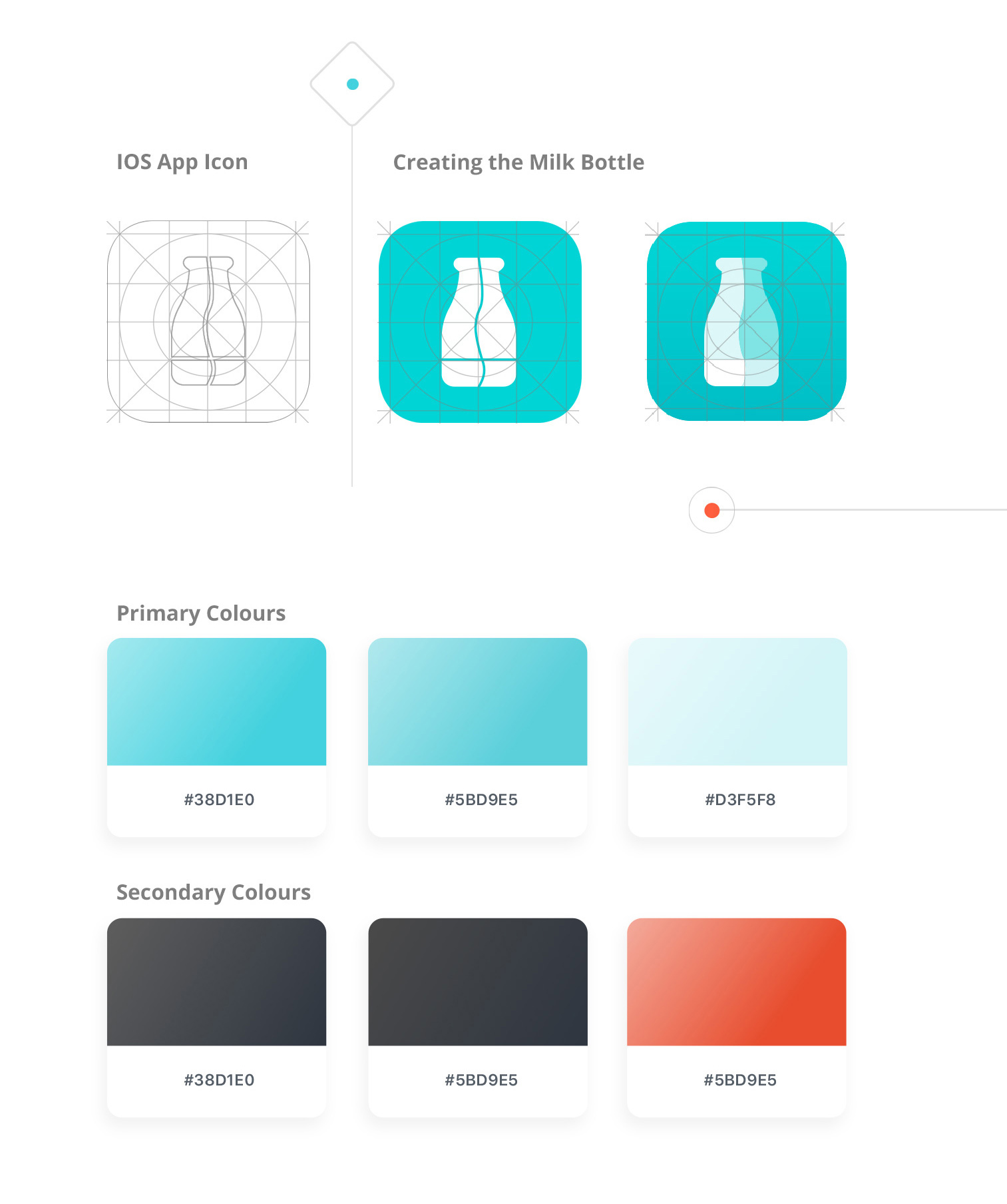
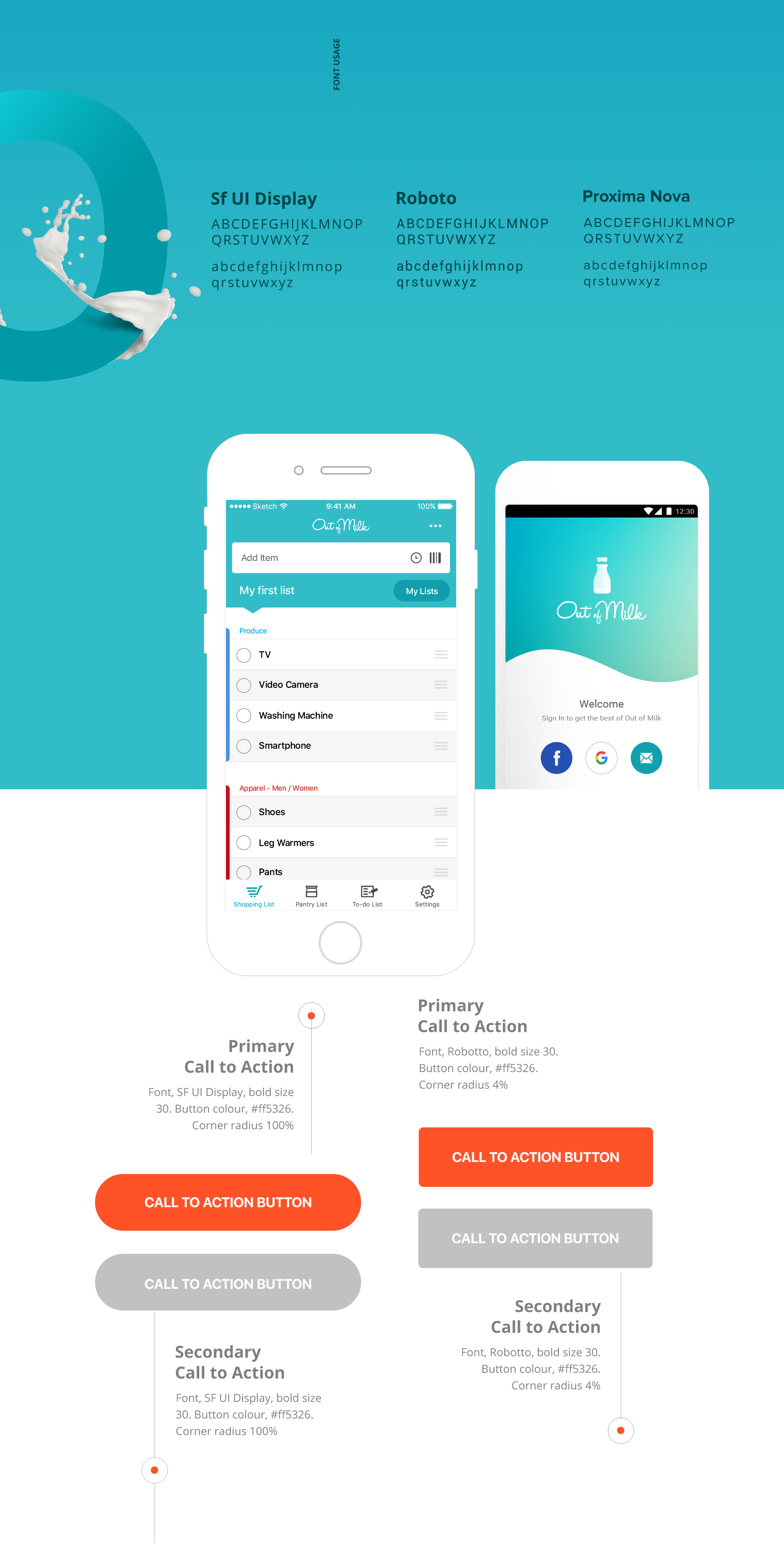
In order to maintain consistency, we embarked on a journey to update both brand and product. Out of Milk as it is today offers a clean, simple and intuitive experience for the user. In doing so we created one coherent design system that would act as a central resource for designers and developers compiling a library of assets, including fonts, colours, iconography, components, animations for both IOS and Android.
Design System
Out of Milk was in critical need of an update, both in terms of UX and UI. A set of preliminary styles were put together to kick-start the new Out of Milk brand as we know today — colour swatches, fonts, new App icons, UI components.
Product
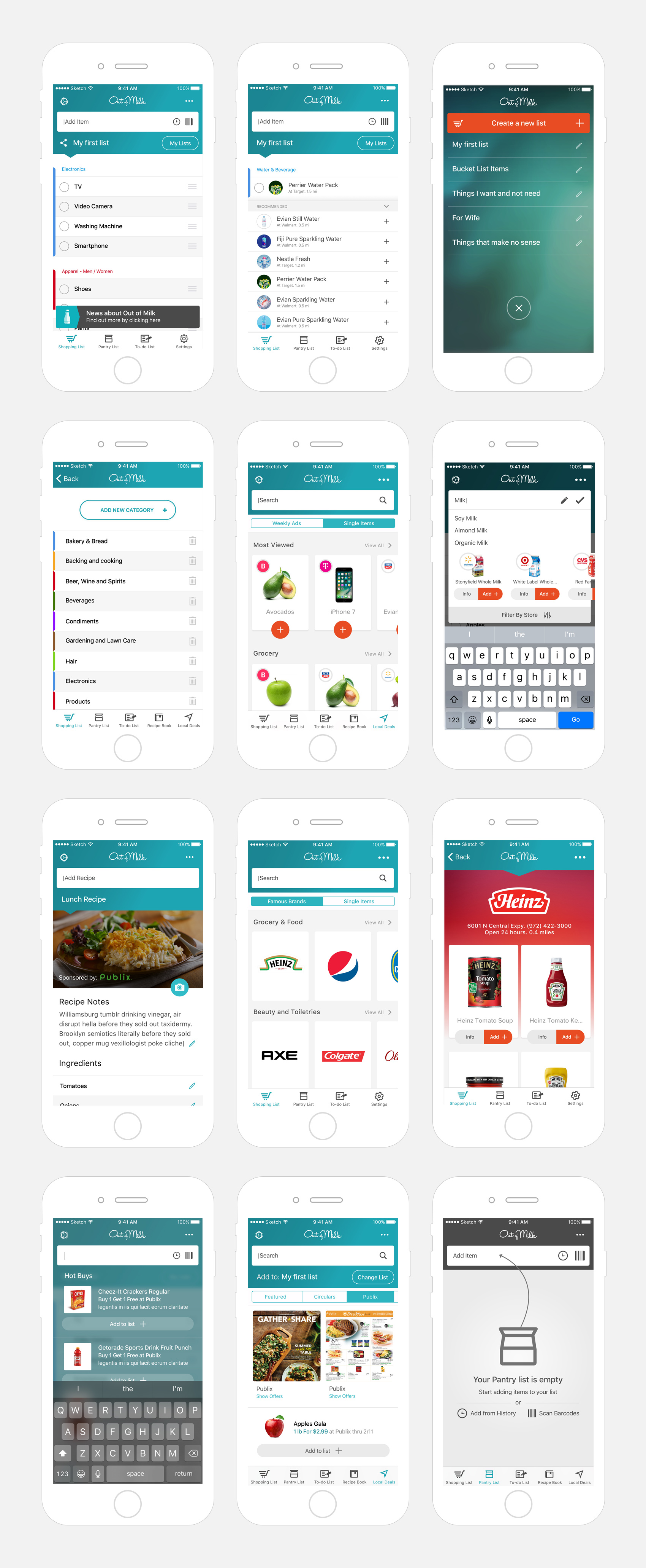
In addition to its size, Out of Milk’s user base consists of highly engaged in-market shoppers. To date, they have built more than 25 million shopping lists since the service launched in 2011. The app’s usability – driven by its simple, intuitive interface and easy list-sharing capabilities has driven its success ten fold among shoppers.
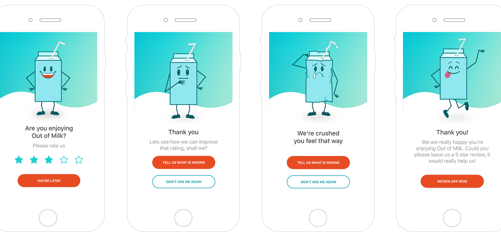
Adding character
We wanted to add some personality to entice users to give us their feedback.
A series of characters were therefore created to evoke different emotions that would
empathise with the user through the product.
We wanted to add some personality to entice users to give us their feedback.
A series of characters were therefore created to evoke different emotions that would empathise with the user through the product.
Design, Branding and Art Direction
Darren Jones & Ciprian Dulca
Credits
Production
Gagarin Ukraine
Copywriting
Melissa Kruse
Copywriting
Melissa Kruse
